My Role
User Research, UX design, UI design, Interaction, Prototyping & Testing, Information Architecture, Web Design
Client
Vamos! Let’s Learn Spanish
Sector
Education, Intranet, E-commerce
Project Date
October 2020 – Jan 2021
I was approached by the founder of a brand-new Spanish language school that will be teaching evening classes in central London. The students are mostly professionals who are learning Spanish as a hobby or to enhance their career prospects. They approached me to create their logo, brand identity and their first website in 2011.
From then on, I was retained as their graphic designer and web designer and I acted as outsourced product manager for their website and all online communications for 10 years until 2021. Vamos launched in 2011 with zero students and by 2016 Vamos was the UK’s largest Spanish language school in the country with over 2000 students and a £ 1 million turnover.
All marketing was done online and 98% of bookings are online via the website I designed. Vamos would have many classrooms filled every evening with students learning Spanish in small groups. This all changed during COVID-19 when all the classes had to go online. After the lockdown, they resumed face-to-face classes but nowadays online classes are more popular with some students doing a combination of both.
The pandemic highlighted that a key area for improvement was the student experience online. The clients desired to foster greater engagement with students, especially those who are not currently in the classroom face-to-face anymore.
After conducting interviews with management, teachers and students, I found the key problems were:
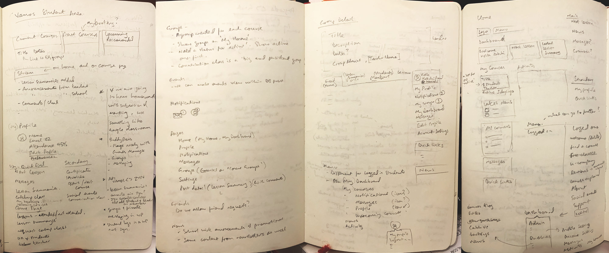
My initial sketches and notes are about making sure I have the information architecture right. I make sure I have all the key elements, content, navigation elements and required actions listed out. Then I start to think about grouping and visual hierarchy. All this whilst bearing in mind any constraints and the tools available within the existing tech stack and design system.

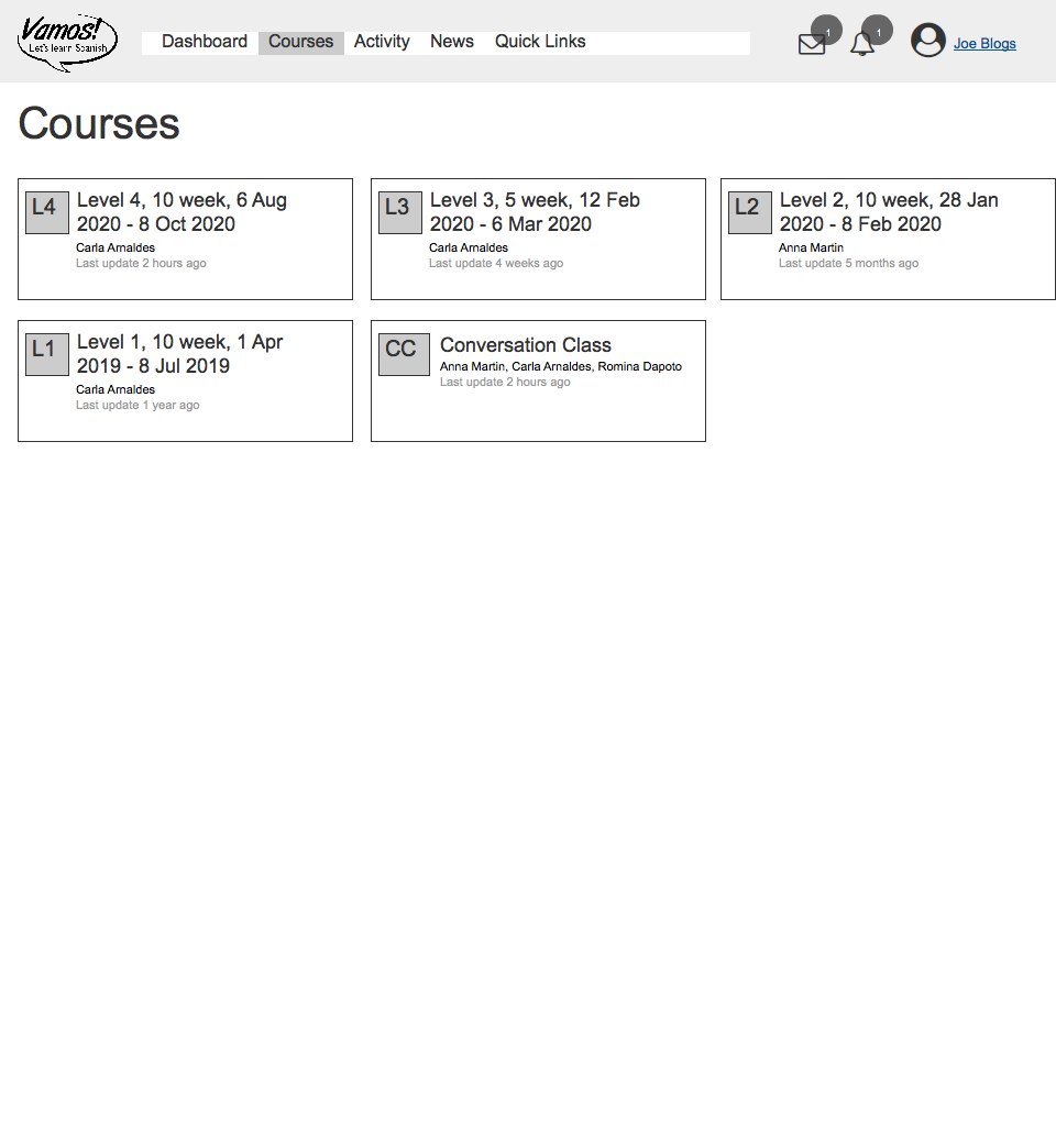
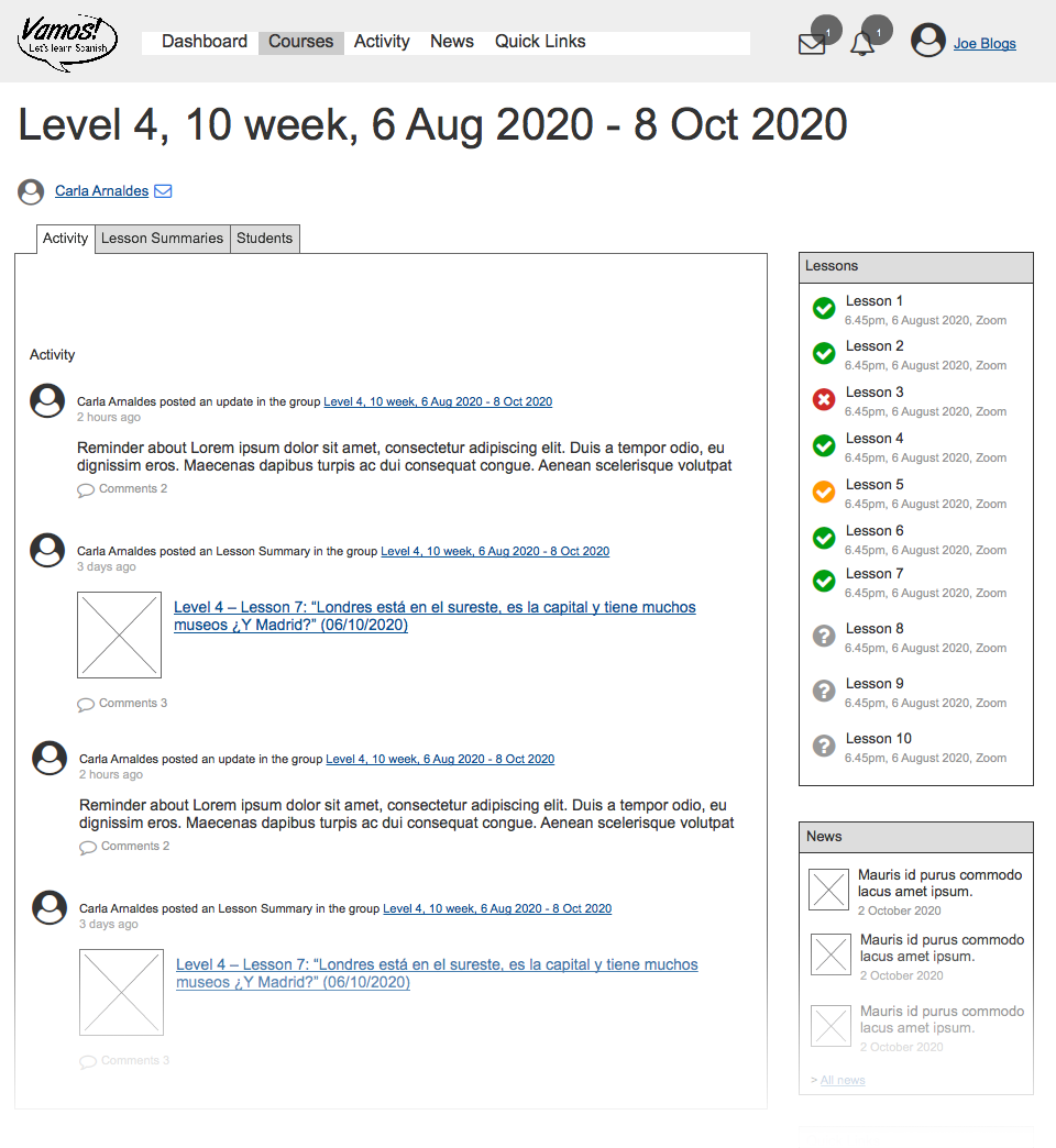
As there is an existing website, I just needed to design the templates that related to the new ‘Student Area’. I created wireframes to illustrate how this area for logged-in users fitted into the main website. I focused on how we could take advantage of the WordPress system of user accounts, user profiles, posts etc and the additional functionality afforded to us from the BuddyPress plugin. Essentially, the most important screens were the Student homepage/dashboard, My courses, and Course detail page.


If I am presenting design solutions to a client or team who is remote (i.e. I will not have a meeting to present the solution in person), I often create a short video walkthrough like this one. In this case, it proved invaluable because the client shared it will several teachers and other key stakeholders who all gave the concept the thumbs up to proceed on to the next stage.
Once the wireframes and development approach was approved I created the full visual design along with an interactive prototype and instructions for the development team.
28% of online bookings are abandoned halfway through the process. Further investigation found that the main cause for these abandoned bookings was that the system created a user account during the process. Therefore when the user attempted to complete the process at a later moment or had a problem with the payment, she would have to log in with her user account to resume the process. The fact that users didn’t always know their account details made this very complicated and many potential students will just give up. Creating the new Student Area required us to solve this problem once and for all because we needed the students to log in to their area easily.
I redesigned the booking form with the main changes being :
I created a wireframe of the new order form design and then this video to explain the design solution system and subsequent changes to the user flow and the main navigation.